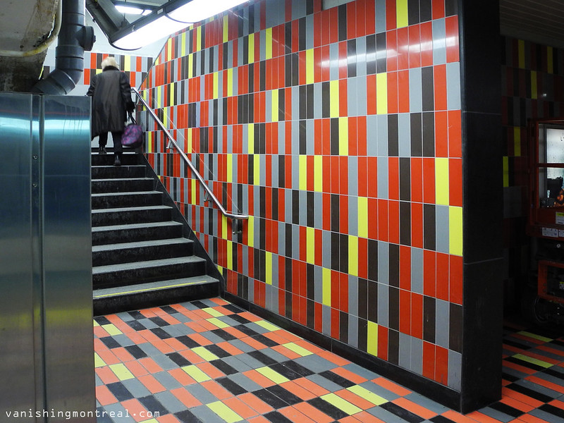
New look for part of the Guy-Concordia metro station. What do you think? Ugly or not? I'm torn. The colors do pop out from the super boring metro station but at the same time I think the person who decided on these colors and patterns was color blind.
-----------
Nouveau look pour une partie de la station de métro Guy-Concordia. Que pensez-vous? Laid ou non? Je suis déchiré. Les couleurs sont vivent pour une station de métro super ennuyante, mais en même temps je pense que la personne qui a décidé sur ces couleurs et ces motifs était surement daltonien.
Yikes! This colour scheme might anger up the blood as grandpa Simpson would say. I think a nice mix of soft blues and whites would have been more appropriate in this case.
ReplyDelete